/* Global Styling */ body{ background: #f1f1f1; font-size:16px; line-height:1.4; font-family: sans-serif;} .amp-wp-post-content p, .amp-wp-content.the_content{ font-family: sans-serif;} a { color: #312C7E; text-decoration: none } .clearfix, .cb { clear: both } amp-iframe{ max-width: 100%; margin-bottom : 20px; } amp-anim { max-width: 100%; } .amp-wp-article amp-addthis{display: inherit;margin-top: 20px;margin-left: -10px;} amp-wistia-player {margin:5px 0px;} .alignleft{ margin-right: 12px; margin-bottom:5px; float: left; } .alignright{ float:right; margin-left: 12px; margin-bottom:5px; } .aligncenter{display: block; text-align:center; margin: 0 auto } #statcounter{width: 1px;height:1px;} ol, ul {list-style-position: inside;} .hide{display:none} /* Template Styles */ .amp-wp-content, .amp-wp-title-bar div { max-width: 1000px; margin: 0 auto; } figure.aligncenter amp-img { margin: 0 auto; } /* Slide Navigation code */ .nav_container{ padding: 18px 15px; background: #312C7E; color: #fff; text-align: center } amp-sidebar{ width: 250px; } amp-sidebar{background:#efefef;} .amp-sidebar-image{ line-height: 100px; vertical-align:middle; } .amp-close-image{ top: 15px; left: 225px; cursor: pointer; } .toggle-navigationv2 ul{ list-style-type: none; margin: 0; padding: 0; } .toggle-navigationv2 ul ul li a{ padding-left: 35px; background:#ffffff; display: inline-block } .toggle-navigationv2 ul li a{ padding: 15px 25px; width: 100%; display: inline-block; background: #fafafa; font-size: 14px; border-bottom: 1px solid #efefef;color:#0a89c0;} .close-nav{ font-size: 12px; background: rgba(0,0,0,0.25); letter-spacing: 1px; display: inline-block; padding: 10px; border-radius: 100px; line-height: 8px; margin: 14px;color: #ffffff; position:relative; right:0px; } .close-nav:hover{ background: rgba(0,0,0,0.45);} .toggle-navigation ul{ list-style-type: none; margin: 0; padding: 0; display: inline-block; width: 100% } .menu-all-pages-container:after{ content: ""; clear: both } .toggle-navigation ul li{ font-size: 13px; border-bottom: 1px solid rgba(0, 0, 0, 0.11); padding: 11px 0px; width: 25%; float: left; text-align: center; margin-top: 6px } .toggle-navigation ul ul{ display: none } .toggle-navigation ul li a{ color: #eee; padding: 15px; } .toggle-navigation{ display: none; background: #444; } .toggle-text{ color: #fff; font-size: 12px; text-transform: uppercase; letter-spacing: 3px; display: inherit; text-align: center; } .toggle-text:before{ content: "..."; font-size: 32px; font-family: georgia; line-height: 0px; margin-left: 0px; letter-spacing: 1px; top: -3px; position: relative; padding-right: 10px; } .nav_container:hover + .toggle-navigation, .toggle-navigation:hover, .toggle-navigation:active, .toggle-navigation:focus{ display: inline-block; width: 100%; } /* Category 2 */ .category-widget-wrapper{ padding:30px 15% 10px 15% } .amp-category-block ul{ list-style-type:none;padding:0 } .amp-category-block-btn{ display: block; text-align: center; font-size: 13px; margin-top: 15px; border-bottom: 1px solid #f1f1f1; text-decoration: none; padding-bottom: 8px;} .category-widget-gutter h4{ margin-bottom: 0px;} .category-widget-gutter ul{ margin-top: 10px; list-style-type:none; padding:0 } .amp-category-post{ width: 32%;display: inline-block; word-wrap: break-word;float: left;} .amp-category-post amp-img{ margin-bottom:5px; } .amp-category-block li:nth-child(3){ margin: 0 1%;} .searchmenu{ right: 15px; } .searchmenu{ top: 31%; position: absolute; } .searchmenu button{ background:transparent; border:none } .closebutton{ background: transparent; border: 0; color: rgba(255, 255, 255, 0.7); border: 1px solid rgba(255, 255, 255, 0.7); border-radius: 30px; width: 32px; height: 32px; font-size: 12px; text-align: center; position: absolute; top: 12px; right: 20px; outline:none } amp-lightbox{ background: rgba(0, 0, 0,0.85); } /* CSS3 icon */ [class*=icono-]:after, [class*=icono-]:before { content: ''; pointer-events: none; } .icono-search:before{ position: absolute; left: 50%; -webkit-transform: rotate(270deg); -ms-transform: rotate(270deg); transform: rotate(270deg); width: 2px; height: 9px; box-shadow: inset 0 0 0 32px; top: 0px; border-radius: 0 0 1px 1px; left: 14px; } [class*=icono-] { display: inline-block; vertical-align: middle; position: relative; font-style: normal; color: #f42; text-align: left; text-indent: -9999px; direction: ltr } .headerlogo a, [class*=icono-]{ color: #F42F42 } /* Pagination */ .amp-wp-content.pagination-holder { background: none; padding: 0; box-shadow: none; height: auto; min-height: auto; } #pagination{ width: 100%; margin-top: 15px; } #pagination .next{ float: right;max-width:50%;text-align: right;} #pagination .prev{ float: left;max-width:50%; } #pagination .next a, #pagination .prev a{ margin-bottom: 12px; -moz-border-radius: 2px; -webkit-border-radius: 2px; border-radius: 2px; -moz-box-shadow: 0 2px 3px rgba(0,0,0,.05); -webkit-box-shadow: 0 2px 3px rgba(0,0,0,.05); box-shadow: 0 2px 3px rgba(0,0,0,.05); padding: 11px 15px; font-size: 12px;} #pagination .next a, #pagination .prev a{ color:#666666; background:#fefefe; display:inline-block; } /* Sticky Social bar in Single */ .ampforwp-social-icons-wrapper{ margin: 0.65em 0px 0.65em 0px; height: 28px; } .s_so{ width: 100%; bottom: 0; display: block; left: 0; box-shadow: 0px 4px 7px #000; background: #fff; padding: 7px 0px 0px 0px; position: fixed; margin: 0; z-index: 10; text-align: center; } .a-so-i{ width: 50px; height: 28px; display: inline-block; background: #5cbe4a;position: relative; top: -8px; padding-top: 0px; margin-bottom:5px; } .a-so-i amp-img{ top: 4px; } amp-social-share[type="facebookmessenger"] { background-image: url(https://img.icons8.com/color/100/000000/facebook-messenger.png); max-height: 33px; } .custom-amp-socialsharing-line{background:#00b900} /* Header */ header.container{line-height: 0;} #header{ background: #fff; text-align: center;padding:17px 0px 17px 0px;display: inline-block;width: 100%;position:relative} #header h1{ text-align: center; font-size: 20px; font-weight: bold; line-height: 1; padding: 4px 3px; margin: 0; } .amp-logo{left: 0;right: 0;display:inline-block} .amp-logo amp-img{ margin: 15px 0px 10px 0px; } .amp-logo amp-img{margin: 0 auto;} main { padding: 30px 15% 10px 15%; } .amp-wp-content.widget-wrapper{padding:12px 10px 10px 10px;} main .amp-wp-content{ margin-bottom: 12px; padding: 15px; } .amp-loop-list, .featured-image-content, .the_content, .taxonomy-description, .taxonomy-image{background: #fff; -moz-border-radius: 2px; -webkit-border-radius: 2px; border-radius: 2px; -moz-box-shadow: 0 2px 3px rgba(0,0,0,.05); -webkit-box-shadow: 0 2px 3px rgba(0,0,0,.05); box-shadow: 0 2px 3px rgba(0,0,0,.05);} .home-post_image{ float: right; margin-left: 15px; margin-bottom: -6px; } .amp-wp-title{ margin-top: 0px; } h2.amp-wp-title , h3.amp-wp-title{ line-height: 30px; } h2.amp-wp-title a , h3.amp-wp-title a{ font-weight: 300; color: #000; font-size: 20px; } h2.amp-wp-title , h3.amp-wp-title , .amp-wp-post-content p{ margin: 0 0 0 5px; word-wrap: break-word;} /* For Excerpt */ .amp-wp-post-content .large-screen-excerpt, .amp-wp-post-content .small-screen-excerpt { display: block; } .amp-wp-post-content p{ font-size: 12px; color: #999; line-height: 20px; margin: 3px 0 0 5px; } main .amp-archive-heading{ background : none; box-shadow: none; padding: 5px; } .amp-sub-archives li{width: 50%;} .amp-sub-archives ul{padding: 0;list-style: none;display: flex;font-size: 12px;line-height: 1.2;margin: 5px 0 10px 0px;}.page-title{font-size: 1.17em;padding: 6px 0;} /* Footer */ #footer{ background: #FFFFFF; font-size: 13px; text-align: center; letter-spacing: 0.2px; padding: 20px 0;color: #222222;} #footer a{color:#0a89c0;} #footer p:first-child{ margin-bottom: 12px; } #footer p{ margin: 0 } .footer_menu ul{ list-style-type: none; padding: 0; text-align: center; margin: 0px 20px 25px 20px; line-height: 27px; font-size: 13px } .footer_menu ul li{ display:inline; margin:0 10px; } .footer_menu ul li:first-child{ margin-left:0 } .footer_menu ul li:last-child{ margin-right:0 } .footer_menu ul ul{ display:none } a.btt:hover { cursor: pointer; } .nav_container { background: rgba(0,0,0,0)} .nav_container a, .nav_container a:hover, .nav_container a:focus{ color:#ffffff } /* Single */ .cmt-button-wrapper{ margin-bottom: 0px; margin-top: 60px; text-align:center } .cmt-button-wrapper a{ color: #fff; background: #312c7e; font-size: 13px; padding: 10px 20px 10px 20px; box-shadow: 0 0px 3px rgba(0,0,0,.04); border-radius: 80px; } h1.amp-wp-title , h2.amp-wp-title{ text-align: center; margin: 0.7em 0px 0.6em 0px; font-size: 1.5em; } .amp-wp-content.post-title-meta, .amp-wp-content.post-pagination-meta{ background: none; padding: 0; box-shadow:none } .post-pagination-meta{ min-height:75px } .single-post .post-pagination-meta{ min-height:auto } .single-post .ampforwp-social-icons{ display:block } .post-pagination-meta .amp-wp-tax-category, .post-title-meta .amp-wp-tax-tag{ display : none; } .amp-meta-wrapper{ border-bottom: 1px solid #DADADA; padding-bottom:10px; display:inline-block; width:100%; margin-bottom:0 } .amp-wp-meta{ padding-left: 0; } .amp-wp-tax-category{ float:right } .amp-wp-tax-tag, .amp-wp-meta li{ list-style: none; display: inline-block; } li.amp-wp-tax-category{ float: right } .amp-wp-byline, .amp-wp-posted-on{ float: left } .amp-wp-content amp-img{ max-width: 100%; } figure{ margin: 0; } figcaption{ font-size: 11px; margin-bottom: 11px; background: #eee; padding: 6px 8px;text-align:center; } .amp-wp-author:before{ content: "By "; color: #555; } .amp-wp-author{ margin-right: 1px; } .amp-wp-meta{ font-size: 12px; color: #555; } .amp-wp-author-name:before{content:'By';} .amp-ad-wrapper{ text-align: center } .single-post main{ padding:12px 15% 10px 15% } .the_content p{ margin-top: 5px; color: #333; font-size: 15px; line-height: 26px; margin-bottom: 15px;word-break: break-word; } .the_content small{font-size:11px;line-height:1.2;color:#111;margin-bottom: 5px;display: inline-block;} .amp-wp-tax-tag{ font-size: 13px; border: 0; display: inline-block; margin: 0.5em 0px 0.7em 0px; width: 100%; } main .amp-wp-content.featured-image-content{ padding: 0px; border: 0; margin-bottom: 0; box-shadow: none;text-align: center; } .amp-wp-article-featured-image amp-img {margin: 0 auto;} .amp-wp-article-featured-image.wp-caption .wp-caption-text, .ampforwp-gallery-item .wp-caption-text{color: #696969; font-size: 11px; line-height: 15px; background: #eee; margin: 0; padding: .66em .75em; text-align: center;} .ampforwp-gallery-item.amp-carousel-slide { padding-bottom: 20px;} .amp-wp-content.post-pagination-meta{ max-width: 1030px;margin:0 auto; } .single-post .ampforwp-social-icons.ampforwp-social-icons-wrapper{ margin: 0.9em auto 0.9em auto ; max-width: 1030px; } .amp-wp-article-header.amp-wp-article-category.ampforwp-meta-taxonomy{ margin: 10px auto; max-width: 1030px; } .ampforwp_single_excerpt { margin-bottom:15px; font-size: 15px; text-align:center} .single-post .amp_author_area amp-img{ margin: 0; float: left; margin-right: 12px; border-radius: 60px; } .single-post .amp_author_area .amp_author_area_wrapper{ display: inline-block; width: 100%; line-height: 1.4; margin-top: 2px; font-size: 13px; color:#333;} .a-so-twitter{background:#1da1f2} .a-so-i-rounded-author {padding: 10px 0px 10px 10px;display: inline-table;border-radius: 50%;cursor: pointer;} /* Related Posts */ main .amp-wp-content.relatedpost{ background: none; box-shadow: none; max-width: 1030px; padding:0px 0 0 0; margin:1.8em auto 1.5em auto } .rp .related-title, .cmts_list h3{ font-size: 14px; font-weight: bold; letter-spacing: 0.4px; margin: 15px 0 10px 0; color: #333; } .rp .related-title { display: block; } .rp ol{ list-style-type:none; margin:0; padding:0 } .rp ol li{ display:inline-block; width:100%; margin-bottom: 12px; background: #fefefe; -moz-border-radius: 2px; -webkit-border-radius: 2px; border-radius: 2px; -moz-box-shadow: 0 2px 3px rgba(0,0,0,.05); -webkit-box-shadow: 0 2px 3px rgba(0,0,0,.05); box-shadow: 0 2px 3px rgba(0,0,0,.05); padding: 0px; } .rp .related_link{ margin-top:18px; margin-bottom:10px; margin-right:10px } .rp .related_link a{ font-weight: 300; color: #000; font-size: 18px; } .rp ol li amp-img{ width:100px; float:left; margin-right:15px } .rp ol li p{ font-size: 12px; color: #999; line-height: 1.2; margin: 12px 0 0 0;word-break: break-word;} .no_related_thumbnail{ padding: 15px 18px; } .no_related_thumbnail .related_link{ margin: 16px 18px 20px 19px; } /* Comments */ .page-numbers{padding: 9px 10px;background: #fff;font-size: 14px} .ampforwp-comment-wrapper{margin:1.8em 0px 1.5em 0px} main .amp-wp-content.cmts_list {background: none;box-shadow: none;max-width: 1030px;padding:0} .cmts_list div{ display:inline-block;} .cmts_list ul{ margin:0;padding:0} .cmts_list ul.children{ padding-bottom:10px; margin-left: 4%; width: 96%;} .cmts_list ul li p{ margin:0;font-size:15px;clear:both;padding-top:16px; word-break: break-word;} .cmts_list ul li{ font-size:13px;list-style-type:none; margin-bottom: 12px; background: #fefefe; -moz-border-radius: 2px; -webkit-border-radius: 2px; border-radius: 2px; -moz-box-shadow: 0 2px 3px rgba(0,0,0,.05); -webkit-box-shadow: 0 2px 3px rgba(0,0,0,.05); box-shadow: 0 2px 3px rgba(0,0,0,.05);padding: 0px;max-width: 1000px;width:100%;} .cmts_list ul li .cmt-body{ padding: 25px;width: 91%;} .cmts_list ul li .cmt-body .cmt-author{ margin-right:5px} .cmt-author{ float:left } .cmt-author-img{float: left; margin-right: 5px; border-radius: 60px;} .single-post footer.cmt-meta{ padding-bottom: 0; line-height: 1.7;} .cmts_list li li{ margin: 20px 20px 10px 20px;background: #f7f7f7;box-shadow: none;border: 1px solid #eee;} .cmts_list li li li{ margin:20px 20px 10px 20px} .cmt-content amp-img{max-width: 300px;} .amp-facebook-comments{margin-top:45px} /* ADS */ .amp_home_body .amp_ad_1{ margin-top: 10px; margin-bottom: -20px; } .single-post .amp_ad_1{ margin-top: 10px; margin-bottom: -20px; } html .single-post .ampforwp-incontent-ad-1 { margin-bottom: 10px; } .amp-ad-4{ margin-top:10px; } .amp-wp-content blockquote { border-left: 3px solid; margin: 0; padding: 15px 20px 8px 24px; background: #f3f3f3; } pre { white-space: pre-wrap; } /* Tables */ table { display: -webkit-box; display: -ms-flexbox; display: flex; -ms-flex-wrap: wrap; flex-wrap: wrap; overflow-x: auto; } table a:link { font-weight: bold; text-decoration: none; } table a:visited { color: #999999; font-weight: bold; text-decoration: none; } table a:active, table a:hover { color: #bd5a35; text-decoration: underline; } table { color: #666; font-size: 12px; text-shadow: 1px 1px 0px #fff; background: inherit; margin: 0px; width: 95%; } table th { padding: 21px 25px 22px 25px; border-top: 1px solid #fafafa; border-bottom: 1px solid #e0e0e0; background: #ededed; background: -webkit-gradient(linear, left top, left bottom, from(#ededed), to(#ebebeb)); background: -moz-linear-gradient(top, #ededed, #ebebeb); } table th:first-child { text-align: left; padding-left: 20px; } table tr:first-child th:first-child { -moz-border-radius-topleft: 3px; -webkit-border-top-left-radius: 3px; border-top-left-radius: 3px; } table tr:first-child th:last-child { -moz-border-radius-topright: 3px; -webkit-border-top-right-radius: 3px; border-top-right-radius: 3px; } table tr { text-align: center; padding-left: 20px;border: 2px solid #eee; } table td:first-child { text-align: left; padding-left: 20px; border-left: 0; } table td { padding: 18px; border-top: 1px solid #ffffff; border-bottom: 1px solid #e0e0e0; border-left: 1px solid #e0e0e0; background: #fafafa; background: -webkit-gradient(linear, left top, left bottom, from(#fbfbfb), to(#fafafa)); background: -moz-linear-gradient(top, #fbfbfb, #fafafa); } table tr.even td { background: #f6f6f6; background: -webkit-gradient(linear, left top, left bottom, from(#f8f8f8), to(#f6f6f6)); background: -moz-linear-gradient(top, #f8f8f8, #f6f6f6); } table tr:last-child td {border-bottom: 0;} table tr:last-child td:first-child { -moz-border-radius-bottomleft: 3px; -webkit-border-bottom-left-radius: 3px; border-bottom-left-radius: 3px; } table tr:last-child td:last-child { -moz-border-radius-bottomright: 3px; -webkit-border-bottom-right-radius: 3px; border-bottom-right-radius: 3px; } table tr:hover td { background: #f2f2f2; background: -webkit-gradient(linear, left top, left bottom, from(#f2f2f2), to(#f0f0f0)); background: -moz-linear-gradient(top, #f2f2f2, #f0f0f0); } .hide-meta-info{ display: none; } /* Responsive */ @media screen and (min-width: 650px) { table {display: inline-table;} } @media screen and (max-width: 800px) { .single-post main{ padding: 12px 10px 10px 10px } } @media screen and (max-width: 630px) { .related_link { margin: 16px 18px 20px 19px; } .amp-category-post {line-height: 1.45;font-size: 14px; } .amp-category-block li:nth-child(3) {margin:0 0.6%} } @media screen and (max-width: 510px) { .ampforwp-tax-category span{ display:none } .rp ol li p{ line-height: 1.6; margin: 7px 0 0 0; } .rp .related_link { margin: 17px 18px 17px 19px; } .cmts_list ul li .cmt-body{ width:auto } } @media screen and (max-width: 425px) { .alignright, .alignleft {float: none;} .rp .related_link { margin: 13px 18px 14px 19px; } .rp .related_link a{ font-size: 18px; line-height: 1.7; } .amp-meta-wrapper{ display: inline-block; margin-bottom: 0px; margin-top: 8px; width:100% } .ampforwp-tax-category{ padding-bottom:0 } h1.amp-wp-title{ margin: 16px 0px 13px 0px; } .amp-wp-byline{ padding:0 } .rp .related_link a { font-size: 17px; line-height: 1.5; } .amp-wp-post-content .large-screen-excerpt, .related_link .large-screen-excerpt {display:none;} } @media screen and (max-width: 375px) { #pagination .next a, #pagination .prev a{ padding: 10px 6px; font-size: 11px; color: #666; } .rp .related-title, .cmts_list h3{ margin-top:15px; } #pagination .next{ margin-bottom:15px;} .rp .related_link a { font-size: 15px; line-height: 1.6; } } @media screen and (max-width: 340px) { .rp .related_link a { font-size: 15px; } .single-post main{ padding: 10px 5px 10px 5px } .the_content .amp-ad-wrapper{ text-align: center; margin-left: -13px; } .amp-category-post {line-height: 1.45;font-size: 12px; } .amp-category-block li:nth-child(3) {margin:0%} } @media screen and (max-width: 320px) { .rp .related_link a { font-size: 13px; } h1.amp-wp-title{ font-size:17px; padding:0px 4px } } @media screen and (max-width: 400px) { .amp-wp-title{ font-size: 19px; margin: 21px 10px -1px 10px; } } @media screen and (max-width: 767px) { .amp-wp-post-content .small-screen-excerpt { display: block; } main, .amp-category-block, .category-widget-wrapper{ padding: 15px 18px 0px 18px; } .toggle-navigation ul li{ width: 50% } #pagination .next{ width:100%;} #pagination .prev{ float: none;width:100%; } } @media screen and (max-width: 495px) { h2.amp-wp-title a{ font-size: 17px; line-height: 26px;} } .amp-wp-tax-tag a, a, .amp-wp-author, .headerlogo a, [class*=icono-] { color: #0a89c0;; } body a {color: #0a89c0 } .amp-wp-content blockquote{ border-color:#0a89c0;; } .cmt-button-wrapper a { background: #0a89c0;; } amp-user-notification { border-color: #0a89c0;; } amp-user-notification button { background-color: #0a89c0;; } .single-post footer { padding-bottom: 40px; } .amp-ad-2{ margin-bottom: 50px; } .body.single-post .s_so{z-index:99999;} .body.single-post .adsforwp-stick-ad, .body.single-post amp-sticky-ad{padding-top:4px;padding-bottom:48px;} .body.single-post .ampforwp-sticky-custom-ad{ bottom: 43px; padding: 4px 0px 0px; } .body.single-post .afw a{line-height:0;} .body.single-post amp-sticky-ad amp-sticky-ad-top-padding{height:0px;} /**/ .amp-wp-author:before{ content: " By "; } .ampforwp-tax-category span:first-child:after { content: ' '; } .ampforwp-tax-category span:after,.ampforwp-tax-tag span:after { content: ', '; } .ampforwp-tax-category span:last-child:after, .ampforwp-tax-tag span:last-child:after { content: ' '; } .amp-wp-article-content img { max-width: 100%; } .design_2_wrapper .amp-loop-list .amp-wp-meta {display: none;} .breadcrumb{line-height: 1;margin-bottom:6px;} .breadcrumb ul, .category-single ul{padding:0; margin:0;} .breadcrumb ul li{display:inline;} .breadcrumb ul li a, .breadcrumb ul li span{font-size:12px;} .breadcrumb ul li a::after {content: "►";display: inline-block;font-size: 8px;padding: 0 6px 0 7px;vertical-align: middle;opacity: 0.5;position:relative;top: -0.5px;} .breadcrumb ul li:hover a::after{color:#c3c3c3;} .breadcrumb .bread-post{color: #555;} .breadcrumb ul li:last-child a::after{display:none;} .amp-menu > li > a > amp-img, .sub-menu > li > a > amp-img { display: inline-block; margin-right: 4px; } .menu-item amp-img {width: 16px; height: 11px; display: inline-block; margin-right: 5px;} .amp-carousel-container {position: relative;width: 100%;height: 100%;} .amp-carousel-img img {object-fit: contain;} /* Slide Navigation code */ .amp-menu li{position:relative;margin:0;} .amp-menu li.menu-item-has-children ul{display:none;margin:0;background:#222} .amp-menu li.menu-item-has-children ul ul{background:#444} .amp-menu input{display:none} .amp-menu [id^=drop]:checked + label + ul{ display: block;} .amp-menu .toggle:after{content:'\25be';position:absolute;padding: 10px 15px 10px 30px;right:0;font-size:18px;color:#ccc;top:5px;z-index:10000;line-height:1} .amp-ad-wrapper span { display: inherit; font-size: 12px; line-height: 1;} /******* Paste your Custom CSS in this Editor *******/ @media(max-width:480px){ } @media(max-width:480px){ .amp-wp-content .alignright , .amp-wp-content .alignleft { float:none; margin:0 auto; } } @media (min-width: 768px){ .wp-block-columns { display:flex; } .wp-block-column { max-width:50%; margin: 0px 10px; } } /*** H-1 to H-6 Font Sizes ***/ .amp-wp-content.the_content h1, .amp-wp-content.the_content h2, .amp-wp-content.the_content h3, .amp-wp-content.the_content h4, .amp-wp-content.the_content h5, .amp-wp-content.the_content h6{margin: 15px 0px;} .amp-wp-content.the_content h1 {font-size: 32px;} .amp-wp-content.the_content h2 {font-size: 27px;} .amp-wp-content.the_content h3 {font-size: 24px;} .amp-wp-content.the_content h4 {font-size: 20px;} .amp-wp-content.the_content h5 {font-size: 17px;} .amp-wp-content.the_content h6 {font-size: 15px;} amp-facebook-like{ max-height: 28px; } .rp .related_link a.readmore-rp { font-size: 13px; margin-left: 5px; color: #999; font-weight: normal; } .link-menu .toggle { width: 100%; height: 100%; position: absolute; top: 0px; right: 0; cursor:pointer; } .ampforwp-blocks-gallery-caption{ font-size: 16px; } .amp-wp-content table , .cntn-wrp.artl-cnt table{height: auto;} amp-img.amp-wp-enforced-sizes[layout=intrinsic] > img, .amp-wp-unknown-size > img { object-fit: contain; } .rtl amp-carousel {direction: ltr;} .rtl .amp-menu .toggle:after{left:0;right:unset;} .sharedaddy li{display:none} sub {vertical-align: sub;font-size: small;} sup {vertical-align: super;font-size: small;} amp-call-tracking a {display: none;} @media only screen and (max-width: 480px) { svg {max-width: 250px;max-height: 250px;} } h2.amp-post-title { word-break: break-word; word-wrap: break-word; } .btt{ position: fixed; bottom: 55px; right: 20px; background: rgba(71, 71, 71, 0.5); color: #fff; border-radius: 100%; width: 50px; height: 50px; text-decoration: none; } .btt:hover{color:#fff;background:#474747;} .btt:before{ content: '\25be'; display: block; font-size: 35px; font-weight: 600; color: #fff; transform: rotate(180deg); text-align: center; line-height: 1.5; } /* Tables */ .wp-block-table{ min-width :240px;} table.wp-block-table.alignright,table.wp-block-table.alignleft,table.wp-block-table.aligncenter{width: auto;} table.wp-block-table.aligncenter{width: 50%;} table.wp-block-table.alignfull,table.wp-block-table.alignwide{display: table;} table { overflow-x: auto; } table a:link { font-weight: bold; text-decoration: none; } table a:visited { color: #999999; font-weight: bold; text-decoration: none; } table a:active, table a:hover { color: #bd5a35; text-decoration: underline; } table { font-family: Arial, Helvetica, sans-serif; color: #666; font-size: 15px; text-shadow: 1px 1px 0px #fff; background: inherit; margin: 0px; width: 95%; } table th { padding: 21px 25px 22px 25px; border-top: 1px solid #fafafa; border-bottom: 1px solid #e0e0e0; background: #ededed; } table th:first-child { text-align: left; padding-left: 20px; } table tr:first-child th:first-child { -webkit-border-top-left-radius: 3px; border-top-left-radius: 3px; } table tr:first-child th:last-child { -webkit-border-top-right-radius: 3px; border-top-right-radius: 3px; } table tr { text-align: center; padding-left: 20px; border: 2px solid #eee;} table td:first-child {padding-left: 20px; border-left: 0; } table td { padding: 18px; border-top: 1px solid #ffffff; border-bottom: 1px solid #e0e0e0; border-left: 1px solid #e0e0e0;} table tr.even td { background: #f6f6f6; background: -webkit-gradient(linear, left top, left bottom, from(#f8f8f8), to(#f6f6f6)); } table tr:last-child td {border-bottom: 0;} table tr:last-child td:first-child { -webkit-border-bottom-left-radius: 3px; border-bottom-left-radius: 3px; } table tr:last-child td:last-child { -webkit-border-bottom-right-radius: 3px; border-bottom-right-radius: 3px; } @media screen and (min-width: 650px) { table {display: inline-table;} } .has-text-align-left { text-align: left;} .has-text-align-right { text-align: right;} .has-text-align-center { text-align: center;} amp-web-push-widget button.amp-subscribe { display: inline-flex; align-items: center; border-radius: 5px; border: 0; box-sizing: border-box; margin: 0; padding: 10px 15px; cursor: pointer; outline: none; font-size: 15px; font-weight: 500; background: #4A90E2; margin-top: 7px; color: white; box-shadow: 0 1px 1px 0 rgba(0, 0, 0, 0.5); -webkit-tap-highlight-color: rgba(0, 0, 0, 0); } .amp-logo amp-img{width:190px} .amp-menu input{display:none;}.amp-menu li.menu-item-has-children ul{display:none;}.amp-menu li{position:relative;display:block;}.amp-menu > li a{display:block;} /* Inline styles */ img.acss9737a{padding:2px;}
X

La Escasez y la Abundancia…

Secretos de la Interfaz Mental – Escasez y Abundancia

Parte I

Cuando algo es escaso interesa más; cuando algo abunda, interesa menos. La escasez induce a atender más las preferencias ya establecidas, la abundancia induce a explorar otras opciones.

Cuando se nos presentan a consideración una multitud de ítems a la vez, lo que abunde – o su aparente abundancia – y lo que escasee – o su aparente escasez – determinarán la dirección, y tal vez la efectividad, de nuestros procesos mentales.

Se ha comprobado que la escasez «percibida» provoca una leve excitación psicofísica. Y aquí lo interesante: se comprobó que esta excitación puede inducirse para obtener el mismo efecto sobre la atención que si el cerebro hubiese percibido escasez. El «efecto de excitación relacionada a la escasez» se puede obtener, por ejemplo, mediante el uso de colores brillantes como fondo (aumenta levemente la excitación psicológica) y también mediante la exposición a palabras claramente relacionadas con «escasez».

La consecuencia práctica es que podemos inducir la selectividad de la atención con la escasez, o la exploración combinatoria con la abundancia.

Teniendo esto en cuenta, dado su peso empírico, también podemos analizar con mirada renovada otros aspectos del procesamiento mental de la información. Por ejemplo, la explosión informativa. Esto es, abundancia informativa. Y abundancia de problemas de sobrecarga cognitiva con datos e información.

La abundancia informativa en las redes, explica la forma en la cual se comporta la mente. Es real que en las redes sociales el cerebro funciona en «Modo Red Social». La cognición está determinada por el entorno en el que nos estamos moviendo.

No es la única vía de sobrecarga cognitiva, y es lo que preocupa. Puedes apostar a que en un minuto actual se produce más información de la que se producía en 50 años durante la Edad Moderna. Y el valor o la insignificancia de esta información no es el punto, el punto es que estamos viajando en medio de ese Big Bang informativo.


La escasez y la abundancia – Parte II

«¿¿Y qué podemos hacer??»

Calma, calma. Los científicos y tecnólogos están trabajando desde hace décadas para reducir la carga cognitiva del cerebro ante la complejidad informativa creciente.

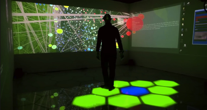
Y adivina qué utilizan para reducir la complejidad y poder procesar con mejores resultados grandes cantidades de datos e información… Claro que sí, tecnologías de realidad virtual y realidades mixtas, realidades digitalmente creadas. ¿Para qué? Para permitirnos interactuar FÍSICAMENTE con la información y de esa manera aprovechar la colaboración neuronal del sistema sensomotor en el procesamiento de la información.

Del costo de tal tecnología te podrás dar una idea sabiendo que cuenta con un aporte de financiación – en el 2014 – de 6,5 millones de Euros emitidos por la Comisión Europea.

La Union Europea y los Estados Unidos están absolutamente convencidos de que la digitalización del cerebro es la clave de la supervivencia y/o de la hegemonía. Y no lo dice David Icke ni Fabio Zerpa, ni es información extrapolada de las fantasías en las series como Intelligence, Person of Interest, etc.

El proyecto europeo CEED es esto: Página web del proyecto y con video, en: Video en YT

Y el proyecto europeo The Human Brain Project es esto:  Página web del proyecto En video Video de YT

Y el proyecto estadounidense The Brain Iniciative es esto: Página web del proyecto En video: Video en YT

Y los científicos que se oponen no son pocos, según puedes ver en:  Página de noticias En video en: Video en YT


Patricio Jorge Vargas:
Related Post