/* Global Styling */ body{ background: #f1f1f1; font-size:16px; line-height:1.4; font-family: sans-serif;} .amp-wp-post-content p, .amp-wp-content.the_content{ font-family: sans-serif;} a { color: #312C7E; text-decoration: none } .clearfix, .cb { clear: both } amp-iframe{ max-width: 100%; margin-bottom : 20px; } amp-anim { max-width: 100%; } .amp-wp-article amp-addthis{display: inherit;margin-top: 20px;margin-left: -10px;} amp-wistia-player {margin:5px 0px;} .alignleft{ margin-right: 12px; margin-bottom:5px; float: left; } .alignright{ float:right; margin-left: 12px; margin-bottom:5px; } .aligncenter{display: block; text-align:center; margin: 0 auto } #statcounter{width: 1px;height:1px;} ol, ul {list-style-position: inside;} .hide{display:none} /* Template Styles */ .amp-wp-content, .amp-wp-title-bar div { max-width: 1000px; margin: 0 auto; } figure.aligncenter amp-img { margin: 0 auto; } /* Slide Navigation code */ .nav_container{ padding: 18px 15px; background: #312C7E; color: #fff; text-align: center } amp-sidebar{ width: 250px; } amp-sidebar{background:#efefef;} .amp-sidebar-image{ line-height: 100px; vertical-align:middle; } .amp-close-image{ top: 15px; left: 225px; cursor: pointer; } .toggle-navigationv2 ul{ list-style-type: none; margin: 0; padding: 0; } .toggle-navigationv2 ul ul li a{ padding-left: 35px; background:#ffffff; display: inline-block } .toggle-navigationv2 ul li a{ padding: 15px 25px; width: 100%; display: inline-block; background: #fafafa; font-size: 14px; border-bottom: 1px solid #efefef;color:#0a89c0;} .close-nav{ font-size: 12px; background: rgba(0,0,0,0.25); letter-spacing: 1px; display: inline-block; padding: 10px; border-radius: 100px; line-height: 8px; margin: 14px;color: #ffffff; position:relative; right:0px; } .close-nav:hover{ background: rgba(0,0,0,0.45);} .toggle-navigation ul{ list-style-type: none; margin: 0; padding: 0; display: inline-block; width: 100% } .menu-all-pages-container:after{ content: ""; clear: both } .toggle-navigation ul li{ font-size: 13px; border-bottom: 1px solid rgba(0, 0, 0, 0.11); padding: 11px 0px; width: 25%; float: left; text-align: center; margin-top: 6px } .toggle-navigation ul ul{ display: none } .toggle-navigation ul li a{ color: #eee; padding: 15px; } .toggle-navigation{ display: none; background: #444; } .toggle-text{ color: #fff; font-size: 12px; text-transform: uppercase; letter-spacing: 3px; display: inherit; text-align: center; } .toggle-text:before{ content: "..."; font-size: 32px; font-family: georgia; line-height: 0px; margin-left: 0px; letter-spacing: 1px; top: -3px; position: relative; padding-right: 10px; } .nav_container:hover + .toggle-navigation, .toggle-navigation:hover, .toggle-navigation:active, .toggle-navigation:focus{ display: inline-block; width: 100%; } /* Category 2 */ .category-widget-wrapper{ padding:30px 15% 10px 15% } .amp-category-block ul{ list-style-type:none;padding:0 } .amp-category-block-btn{ display: block; text-align: center; font-size: 13px; margin-top: 15px; border-bottom: 1px solid #f1f1f1; text-decoration: none; padding-bottom: 8px;} .category-widget-gutter h4{ margin-bottom: 0px;} .category-widget-gutter ul{ margin-top: 10px; list-style-type:none; padding:0 } .amp-category-post{ width: 32%;display: inline-block; word-wrap: break-word;float: left;} .amp-category-post amp-img{ margin-bottom:5px; } .amp-category-block li:nth-child(3){ margin: 0 1%;} .searchmenu{ right: 15px; } .searchmenu{ top: 31%; position: absolute; } .searchmenu button{ background:transparent; border:none } .closebutton{ background: transparent; border: 0; color: rgba(255, 255, 255, 0.7); border: 1px solid rgba(255, 255, 255, 0.7); border-radius: 30px; width: 32px; height: 32px; font-size: 12px; text-align: center; position: absolute; top: 12px; right: 20px; outline:none } amp-lightbox{ background: rgba(0, 0, 0,0.85); } /* CSS3 icon */ [class*=icono-]:after, [class*=icono-]:before { content: ''; pointer-events: none; } .icono-search:before{ position: absolute; left: 50%; -webkit-transform: rotate(270deg); -ms-transform: rotate(270deg); transform: rotate(270deg); width: 2px; height: 9px; box-shadow: inset 0 0 0 32px; top: 0px; border-radius: 0 0 1px 1px; left: 14px; } [class*=icono-] { display: inline-block; vertical-align: middle; position: relative; font-style: normal; color: #f42; text-align: left; text-indent: -9999px; direction: ltr } .headerlogo a, [class*=icono-]{ color: #F42F42 } /* Pagination */ .amp-wp-content.pagination-holder { background: none; padding: 0; box-shadow: none; height: auto; min-height: auto; } #pagination{ width: 100%; margin-top: 15px; } #pagination .next{ float: right;max-width:50%;text-align: right;} #pagination .prev{ float: left;max-width:50%; } #pagination .next a, #pagination .prev a{ margin-bottom: 12px; -moz-border-radius: 2px; -webkit-border-radius: 2px; border-radius: 2px; -moz-box-shadow: 0 2px 3px rgba(0,0,0,.05); -webkit-box-shadow: 0 2px 3px rgba(0,0,0,.05); box-shadow: 0 2px 3px rgba(0,0,0,.05); padding: 11px 15px; font-size: 12px;} #pagination .next a, #pagination .prev a{ color:#666666; background:#fefefe; display:inline-block; } /* Sticky Social bar in Single */ .ampforwp-social-icons-wrapper{ margin: 0.65em 0px 0.65em 0px; height: 28px; } .s_so{ width: 100%; bottom: 0; display: block; left: 0; box-shadow: 0px 4px 7px #000; background: #fff; padding: 7px 0px 0px 0px; position: fixed; margin: 0; z-index: 10; text-align: center; } .a-so-i{ width: 50px; height: 28px; display: inline-block; background: #5cbe4a;position: relative; top: -8px; padding-top: 0px; margin-bottom:5px; } .a-so-i amp-img{ top: 4px; } amp-social-share[type="facebookmessenger"] { background-image: url(https://img.icons8.com/color/100/000000/facebook-messenger.png); max-height: 33px; } .custom-amp-socialsharing-line{background:#00b900} /* Header */ header.container{line-height: 0;} #header{ background: #fff; text-align: center;padding:17px 0px 17px 0px;display: inline-block;width: 100%;position:relative} #header h1{ text-align: center; font-size: 20px; font-weight: bold; line-height: 1; padding: 4px 3px; margin: 0; } .amp-logo{left: 0;right: 0;display:inline-block} .amp-logo amp-img{ margin: 15px 0px 10px 0px; } .amp-logo amp-img{margin: 0 auto;} main { padding: 30px 15% 10px 15%; } .amp-wp-content.widget-wrapper{padding:12px 10px 10px 10px;} main .amp-wp-content{ margin-bottom: 12px; padding: 15px; } .amp-loop-list, .featured-image-content, .the_content, .taxonomy-description, .taxonomy-image{background: #fff; -moz-border-radius: 2px; -webkit-border-radius: 2px; border-radius: 2px; -moz-box-shadow: 0 2px 3px rgba(0,0,0,.05); -webkit-box-shadow: 0 2px 3px rgba(0,0,0,.05); box-shadow: 0 2px 3px rgba(0,0,0,.05);} .home-post_image{ float: right; margin-left: 15px; margin-bottom: -6px; } .amp-wp-title{ margin-top: 0px; } h2.amp-wp-title , h3.amp-wp-title{ line-height: 30px; } h2.amp-wp-title a , h3.amp-wp-title a{ font-weight: 300; color: #000; font-size: 20px; } h2.amp-wp-title , h3.amp-wp-title , .amp-wp-post-content p{ margin: 0 0 0 5px; word-wrap: break-word;} /* For Excerpt */ .amp-wp-post-content .large-screen-excerpt, .amp-wp-post-content .small-screen-excerpt { display: block; } .amp-wp-post-content p{ font-size: 12px; color: #999; line-height: 20px; margin: 3px 0 0 5px; } main .amp-archive-heading{ background : none; box-shadow: none; padding: 5px; } .amp-sub-archives li{width: 50%;} .amp-sub-archives ul{padding: 0;list-style: none;display: flex;font-size: 12px;line-height: 1.2;margin: 5px 0 10px 0px;}.page-title{font-size: 1.17em;padding: 6px 0;} /* Footer */ #footer{ background: #FFFFFF; font-size: 13px; text-align: center; letter-spacing: 0.2px; padding: 20px 0;color: #222222;} #footer a{color:#0a89c0;} #footer p:first-child{ margin-bottom: 12px; } #footer p{ margin: 0 } .footer_menu ul{ list-style-type: none; padding: 0; text-align: center; margin: 0px 20px 25px 20px; line-height: 27px; font-size: 13px } .footer_menu ul li{ display:inline; margin:0 10px; } .footer_menu ul li:first-child{ margin-left:0 } .footer_menu ul li:last-child{ margin-right:0 } .footer_menu ul ul{ display:none } a.btt:hover { cursor: pointer; } .nav_container { background: rgba(0,0,0,0)} .nav_container a, .nav_container a:hover, .nav_container a:focus{ color:#ffffff } /* Single */ .cmt-button-wrapper{ margin-bottom: 0px; margin-top: 60px; text-align:center } .cmt-button-wrapper a{ color: #fff; background: #312c7e; font-size: 13px; padding: 10px 20px 10px 20px; box-shadow: 0 0px 3px rgba(0,0,0,.04); border-radius: 80px; } h1.amp-wp-title , h2.amp-wp-title{ text-align: center; margin: 0.7em 0px 0.6em 0px; font-size: 1.5em; } .amp-wp-content.post-title-meta, .amp-wp-content.post-pagination-meta{ background: none; padding: 0; box-shadow:none } .post-pagination-meta{ min-height:75px } .single-post .post-pagination-meta{ min-height:auto } .single-post .ampforwp-social-icons{ display:block } .post-pagination-meta .amp-wp-tax-category, .post-title-meta .amp-wp-tax-tag{ display : none; } .amp-meta-wrapper{ border-bottom: 1px solid #DADADA; padding-bottom:10px; display:inline-block; width:100%; margin-bottom:0 } .amp-wp-meta{ padding-left: 0; } .amp-wp-tax-category{ float:right } .amp-wp-tax-tag, .amp-wp-meta li{ list-style: none; display: inline-block; } li.amp-wp-tax-category{ float: right } .amp-wp-byline, .amp-wp-posted-on{ float: left } .amp-wp-content amp-img{ max-width: 100%; } figure{ margin: 0; } figcaption{ font-size: 11px; margin-bottom: 11px; background: #eee; padding: 6px 8px;text-align:center; } .amp-wp-author:before{ content: "By "; color: #555; } .amp-wp-author{ margin-right: 1px; } .amp-wp-meta{ font-size: 12px; color: #555; } .amp-wp-author-name:before{content:'By';} .amp-ad-wrapper{ text-align: center } .single-post main{ padding:12px 15% 10px 15% } .the_content p{ margin-top: 5px; color: #333; font-size: 15px; line-height: 26px; margin-bottom: 15px;word-break: break-word; } .the_content small{font-size:11px;line-height:1.2;color:#111;margin-bottom: 5px;display: inline-block;} .amp-wp-tax-tag{ font-size: 13px; border: 0; display: inline-block; margin: 0.5em 0px 0.7em 0px; width: 100%; } main .amp-wp-content.featured-image-content{ padding: 0px; border: 0; margin-bottom: 0; box-shadow: none;text-align: center; } .amp-wp-article-featured-image amp-img {margin: 0 auto;} .amp-wp-article-featured-image.wp-caption .wp-caption-text, .ampforwp-gallery-item .wp-caption-text{color: #696969; font-size: 11px; line-height: 15px; background: #eee; margin: 0; padding: .66em .75em; text-align: center;} .ampforwp-gallery-item.amp-carousel-slide { padding-bottom: 20px;} .amp-wp-content.post-pagination-meta{ max-width: 1030px;margin:0 auto; } .single-post .ampforwp-social-icons.ampforwp-social-icons-wrapper{ margin: 0.9em auto 0.9em auto ; max-width: 1030px; } .amp-wp-article-header.amp-wp-article-category.ampforwp-meta-taxonomy{ margin: 10px auto; max-width: 1030px; } .ampforwp_single_excerpt { margin-bottom:15px; font-size: 15px; text-align:center} .single-post .amp_author_area amp-img{ margin: 0; float: left; margin-right: 12px; border-radius: 60px; } .single-post .amp_author_area .amp_author_area_wrapper{ display: inline-block; width: 100%; line-height: 1.4; margin-top: 2px; font-size: 13px; color:#333;} .a-so-twitter{background:#1da1f2} .a-so-i-rounded-author {padding: 10px 0px 10px 10px;display: inline-table;border-radius: 50%;cursor: pointer;} /* Related Posts */ main .amp-wp-content.relatedpost{ background: none; box-shadow: none; max-width: 1030px; padding:0px 0 0 0; margin:1.8em auto 1.5em auto } .rp .related-title, .cmts_list h3{ font-size: 14px; font-weight: bold; letter-spacing: 0.4px; margin: 15px 0 10px 0; color: #333; } .rp .related-title { display: block; } .rp ol{ list-style-type:none; margin:0; padding:0 } .rp ol li{ display:inline-block; width:100%; margin-bottom: 12px; background: #fefefe; -moz-border-radius: 2px; -webkit-border-radius: 2px; border-radius: 2px; -moz-box-shadow: 0 2px 3px rgba(0,0,0,.05); -webkit-box-shadow: 0 2px 3px rgba(0,0,0,.05); box-shadow: 0 2px 3px rgba(0,0,0,.05); padding: 0px; } .rp .related_link{ margin-top:18px; margin-bottom:10px; margin-right:10px } .rp .related_link a{ font-weight: 300; color: #000; font-size: 18px; } .rp ol li amp-img{ width:100px; float:left; margin-right:15px } .rp ol li p{ font-size: 12px; color: #999; line-height: 1.2; margin: 12px 0 0 0;word-break: break-word;} .no_related_thumbnail{ padding: 15px 18px; } .no_related_thumbnail .related_link{ margin: 16px 18px 20px 19px; } /* Comments */ .page-numbers{padding: 9px 10px;background: #fff;font-size: 14px} .ampforwp-comment-wrapper{margin:1.8em 0px 1.5em 0px} main .amp-wp-content.cmts_list {background: none;box-shadow: none;max-width: 1030px;padding:0} .cmts_list div{ display:inline-block;} .cmts_list ul{ margin:0;padding:0} .cmts_list ul.children{ padding-bottom:10px; margin-left: 4%; width: 96%;} .cmts_list ul li p{ margin:0;font-size:15px;clear:both;padding-top:16px; word-break: break-word;} .cmts_list ul li{ font-size:13px;list-style-type:none; margin-bottom: 12px; background: #fefefe; -moz-border-radius: 2px; -webkit-border-radius: 2px; border-radius: 2px; -moz-box-shadow: 0 2px 3px rgba(0,0,0,.05); -webkit-box-shadow: 0 2px 3px rgba(0,0,0,.05); box-shadow: 0 2px 3px rgba(0,0,0,.05);padding: 0px;max-width: 1000px;width:100%;} .cmts_list ul li .cmt-body{ padding: 25px;width: 91%;} .cmts_list ul li .cmt-body .cmt-author{ margin-right:5px} .cmt-author{ float:left } .cmt-author-img{float: left; margin-right: 5px; border-radius: 60px;} .single-post footer.cmt-meta{ padding-bottom: 0; line-height: 1.7;} .cmts_list li li{ margin: 20px 20px 10px 20px;background: #f7f7f7;box-shadow: none;border: 1px solid #eee;} .cmts_list li li li{ margin:20px 20px 10px 20px} .cmt-content amp-img{max-width: 300px;} .amp-facebook-comments{margin-top:45px} /* ADS */ .amp_home_body .amp_ad_1{ margin-top: 10px; margin-bottom: -20px; } .single-post .amp_ad_1{ margin-top: 10px; margin-bottom: -20px; } html .single-post .ampforwp-incontent-ad-1 { margin-bottom: 10px; } .amp-ad-4{ margin-top:10px; } .amp-wp-content blockquote { border-left: 3px solid; margin: 0; padding: 15px 20px 8px 24px; background: #f3f3f3; } pre { white-space: pre-wrap; } /* Tables */ table { display: -webkit-box; display: -ms-flexbox; display: flex; -ms-flex-wrap: wrap; flex-wrap: wrap; overflow-x: auto; } table a:link { font-weight: bold; text-decoration: none; } table a:visited { color: #999999; font-weight: bold; text-decoration: none; } table a:active, table a:hover { color: #bd5a35; text-decoration: underline; } table { color: #666; font-size: 12px; text-shadow: 1px 1px 0px #fff; background: inherit; margin: 0px; width: 95%; } table th { padding: 21px 25px 22px 25px; border-top: 1px solid #fafafa; border-bottom: 1px solid #e0e0e0; background: #ededed; background: -webkit-gradient(linear, left top, left bottom, from(#ededed), to(#ebebeb)); background: -moz-linear-gradient(top, #ededed, #ebebeb); } table th:first-child { text-align: left; padding-left: 20px; } table tr:first-child th:first-child { -moz-border-radius-topleft: 3px; -webkit-border-top-left-radius: 3px; border-top-left-radius: 3px; } table tr:first-child th:last-child { -moz-border-radius-topright: 3px; -webkit-border-top-right-radius: 3px; border-top-right-radius: 3px; } table tr { text-align: center; padding-left: 20px;border: 2px solid #eee; } table td:first-child { text-align: left; padding-left: 20px; border-left: 0; } table td { padding: 18px; border-top: 1px solid #ffffff; border-bottom: 1px solid #e0e0e0; border-left: 1px solid #e0e0e0; background: #fafafa; background: -webkit-gradient(linear, left top, left bottom, from(#fbfbfb), to(#fafafa)); background: -moz-linear-gradient(top, #fbfbfb, #fafafa); } table tr.even td { background: #f6f6f6; background: -webkit-gradient(linear, left top, left bottom, from(#f8f8f8), to(#f6f6f6)); background: -moz-linear-gradient(top, #f8f8f8, #f6f6f6); } table tr:last-child td {border-bottom: 0;} table tr:last-child td:first-child { -moz-border-radius-bottomleft: 3px; -webkit-border-bottom-left-radius: 3px; border-bottom-left-radius: 3px; } table tr:last-child td:last-child { -moz-border-radius-bottomright: 3px; -webkit-border-bottom-right-radius: 3px; border-bottom-right-radius: 3px; } table tr:hover td { background: #f2f2f2; background: -webkit-gradient(linear, left top, left bottom, from(#f2f2f2), to(#f0f0f0)); background: -moz-linear-gradient(top, #f2f2f2, #f0f0f0); } .hide-meta-info{ display: none; } /* Responsive */ @media screen and (min-width: 650px) { table {display: inline-table;} } @media screen and (max-width: 800px) { .single-post main{ padding: 12px 10px 10px 10px } } @media screen and (max-width: 630px) { .related_link { margin: 16px 18px 20px 19px; } .amp-category-post {line-height: 1.45;font-size: 14px; } .amp-category-block li:nth-child(3) {margin:0 0.6%} } @media screen and (max-width: 510px) { .ampforwp-tax-category span{ display:none } .rp ol li p{ line-height: 1.6; margin: 7px 0 0 0; } .rp .related_link { margin: 17px 18px 17px 19px; } .cmts_list ul li .cmt-body{ width:auto } } @media screen and (max-width: 425px) { .alignright, .alignleft {float: none;} .rp .related_link { margin: 13px 18px 14px 19px; } .rp .related_link a{ font-size: 18px; line-height: 1.7; } .amp-meta-wrapper{ display: inline-block; margin-bottom: 0px; margin-top: 8px; width:100% } .ampforwp-tax-category{ padding-bottom:0 } h1.amp-wp-title{ margin: 16px 0px 13px 0px; } .amp-wp-byline{ padding:0 } .rp .related_link a { font-size: 17px; line-height: 1.5; } .amp-wp-post-content .large-screen-excerpt, .related_link .large-screen-excerpt {display:none;} } @media screen and (max-width: 375px) { #pagination .next a, #pagination .prev a{ padding: 10px 6px; font-size: 11px; color: #666; } .rp .related-title, .cmts_list h3{ margin-top:15px; } #pagination .next{ margin-bottom:15px;} .rp .related_link a { font-size: 15px; line-height: 1.6; } } @media screen and (max-width: 340px) { .rp .related_link a { font-size: 15px; } .single-post main{ padding: 10px 5px 10px 5px } .the_content .amp-ad-wrapper{ text-align: center; margin-left: -13px; } .amp-category-post {line-height: 1.45;font-size: 12px; } .amp-category-block li:nth-child(3) {margin:0%} } @media screen and (max-width: 320px) { .rp .related_link a { font-size: 13px; } h1.amp-wp-title{ font-size:17px; padding:0px 4px } } @media screen and (max-width: 400px) { .amp-wp-title{ font-size: 19px; margin: 21px 10px -1px 10px; } } @media screen and (max-width: 767px) { .amp-wp-post-content .small-screen-excerpt { display: block; } main, .amp-category-block, .category-widget-wrapper{ padding: 15px 18px 0px 18px; } .toggle-navigation ul li{ width: 50% } #pagination .next{ width:100%;} #pagination .prev{ float: none;width:100%; } } @media screen and (max-width: 495px) { h2.amp-wp-title a{ font-size: 17px; line-height: 26px;} } .amp-wp-tax-tag a, a, .amp-wp-author, .headerlogo a, [class*=icono-] { color: #0a89c0;; } body a {color: #0a89c0 } .amp-wp-content blockquote{ border-color:#0a89c0;; } .cmt-button-wrapper a { background: #0a89c0;; } amp-user-notification { border-color: #0a89c0;; } amp-user-notification button { background-color: #0a89c0;; } .single-post footer { padding-bottom: 40px; } .amp-ad-2{ margin-bottom: 50px; } .body.single-post .s_so{z-index:99999;} .body.single-post .adsforwp-stick-ad, .body.single-post amp-sticky-ad{padding-top:4px;padding-bottom:48px;} .body.single-post .ampforwp-sticky-custom-ad{ bottom: 43px; padding: 4px 0px 0px; } .body.single-post .afw a{line-height:0;} .body.single-post amp-sticky-ad amp-sticky-ad-top-padding{height:0px;} /**/ .amp-wp-author:before{ content: " By "; } .ampforwp-tax-category span:first-child:after { content: ' '; } .ampforwp-tax-category span:after,.ampforwp-tax-tag span:after { content: ', '; } .ampforwp-tax-category span:last-child:after, .ampforwp-tax-tag span:last-child:after { content: ' '; } .amp-wp-article-content img { max-width: 100%; } .design_2_wrapper .amp-loop-list .amp-wp-meta {display: none;} .breadcrumb{line-height: 1;margin-bottom:6px;} .breadcrumb ul, .category-single ul{padding:0; margin:0;} .breadcrumb ul li{display:inline;} .breadcrumb ul li a, .breadcrumb ul li span{font-size:12px;} .breadcrumb ul li a::after {content: "►";display: inline-block;font-size: 8px;padding: 0 6px 0 7px;vertical-align: middle;opacity: 0.5;position:relative;top: -0.5px;} .breadcrumb ul li:hover a::after{color:#c3c3c3;} .breadcrumb .bread-post{color: #555;} .breadcrumb ul li:last-child a::after{display:none;} .amp-menu > li > a > amp-img, .sub-menu > li > a > amp-img { display: inline-block; margin-right: 4px; } .menu-item amp-img {width: 16px; height: 11px; display: inline-block; margin-right: 5px;} .amp-carousel-container {position: relative;width: 100%;height: 100%;} .amp-carousel-img img {object-fit: contain;} /* Slide Navigation code */ .amp-menu li{position:relative;margin:0;} .amp-menu li.menu-item-has-children ul{display:none;margin:0;background:#222} .amp-menu li.menu-item-has-children ul ul{background:#444} .amp-menu input{display:none} .amp-menu [id^=drop]:checked + label + ul{ display: block;} .amp-menu .toggle:after{content:'\25be';position:absolute;padding: 10px 15px 10px 30px;right:0;font-size:18px;color:#ccc;top:5px;z-index:10000;line-height:1} .amp-ad-wrapper span { display: inherit; font-size: 12px; line-height: 1;} /******* Paste your Custom CSS in this Editor *******/ @media(max-width:480px){ } @media(max-width:480px){ .amp-wp-content .alignright , .amp-wp-content .alignleft { float:none; margin:0 auto; } } @media (min-width: 768px){ .wp-block-columns { display:flex; } .wp-block-column { max-width:50%; margin: 0px 10px; } } /*** H-1 to H-6 Font Sizes ***/ .amp-wp-content.the_content h1, .amp-wp-content.the_content h2, .amp-wp-content.the_content h3, .amp-wp-content.the_content h4, .amp-wp-content.the_content h5, .amp-wp-content.the_content h6{margin: 15px 0px;} .amp-wp-content.the_content h1 {font-size: 32px;} .amp-wp-content.the_content h2 {font-size: 27px;} .amp-wp-content.the_content h3 {font-size: 24px;} .amp-wp-content.the_content h4 {font-size: 20px;} .amp-wp-content.the_content h5 {font-size: 17px;} .amp-wp-content.the_content h6 {font-size: 15px;} amp-facebook-like{ max-height: 28px; } .rp .related_link a.readmore-rp { font-size: 13px; margin-left: 5px; color: #999; font-weight: normal; } .link-menu .toggle { width: 100%; height: 100%; position: absolute; top: 0px; right: 0; cursor:pointer; } .ampforwp-blocks-gallery-caption{ font-size: 16px; } .amp-wp-content table , .cntn-wrp.artl-cnt table{height: auto;} amp-img.amp-wp-enforced-sizes[layout=intrinsic] > img, .amp-wp-unknown-size > img { object-fit: contain; } .rtl amp-carousel {direction: ltr;} .rtl .amp-menu .toggle:after{left:0;right:unset;} .sharedaddy li{display:none} sub {vertical-align: sub;font-size: small;} sup {vertical-align: super;font-size: small;} amp-call-tracking a {display: none;} @media only screen and (max-width: 480px) { svg {max-width: 250px;max-height: 250px;} } h2.amp-post-title { word-break: break-word; word-wrap: break-word; } .btt{ position: fixed; bottom: 55px; right: 20px; background: rgba(71, 71, 71, 0.5); color: #fff; border-radius: 100%; width: 50px; height: 50px; text-decoration: none; } .btt:hover{color:#fff;background:#474747;} .btt:before{ content: '\25be'; display: block; font-size: 35px; font-weight: 600; color: #fff; transform: rotate(180deg); text-align: center; line-height: 1.5; } /* Tables */ .wp-block-table{ min-width :240px;} table.wp-block-table.alignright,table.wp-block-table.alignleft,table.wp-block-table.aligncenter{width: auto;} table.wp-block-table.aligncenter{width: 50%;} table.wp-block-table.alignfull,table.wp-block-table.alignwide{display: table;} table { overflow-x: auto; } table a:link { font-weight: bold; text-decoration: none; } table a:visited { color: #999999; font-weight: bold; text-decoration: none; } table a:active, table a:hover { color: #bd5a35; text-decoration: underline; } table { font-family: Arial, Helvetica, sans-serif; color: #666; font-size: 15px; text-shadow: 1px 1px 0px #fff; background: inherit; margin: 0px; width: 95%; } table th { padding: 21px 25px 22px 25px; border-top: 1px solid #fafafa; border-bottom: 1px solid #e0e0e0; background: #ededed; } table th:first-child { text-align: left; padding-left: 20px; } table tr:first-child th:first-child { -webkit-border-top-left-radius: 3px; border-top-left-radius: 3px; } table tr:first-child th:last-child { -webkit-border-top-right-radius: 3px; border-top-right-radius: 3px; } table tr { text-align: center; padding-left: 20px; border: 2px solid #eee;} table td:first-child {padding-left: 20px; border-left: 0; } table td { padding: 18px; border-top: 1px solid #ffffff; border-bottom: 1px solid #e0e0e0; border-left: 1px solid #e0e0e0;} table tr.even td { background: #f6f6f6; background: -webkit-gradient(linear, left top, left bottom, from(#f8f8f8), to(#f6f6f6)); } table tr:last-child td {border-bottom: 0;} table tr:last-child td:first-child { -webkit-border-bottom-left-radius: 3px; border-bottom-left-radius: 3px; } table tr:last-child td:last-child { -webkit-border-bottom-right-radius: 3px; border-bottom-right-radius: 3px; } @media screen and (min-width: 650px) { table {display: inline-table;} } .has-text-align-left { text-align: left;} .has-text-align-right { text-align: right;} .has-text-align-center { text-align: center;} amp-web-push-widget button.amp-subscribe { display: inline-flex; align-items: center; border-radius: 5px; border: 0; box-sizing: border-box; margin: 0; padding: 10px 15px; cursor: pointer; outline: none; font-size: 15px; font-weight: 500; background: #4A90E2; margin-top: 7px; color: white; box-shadow: 0 1px 1px 0 rgba(0, 0, 0, 0.5); -webkit-tap-highlight-color: rgba(0, 0, 0, 0); } .amp-logo amp-img{width:190px} .amp-menu input{display:none;}.amp-menu li.menu-item-has-children ul{display:none;}.amp-menu li{position:relative;display:block;}.amp-menu > li a{display:block;} /* Inline styles */ ins.acss263b2{display:block;}img.acss9737a{padding:2px;}
X

Mitos sobre Mitos

Es una creencia común que los mitos ocupan espacios vacíos de «racionalidad» o pensamiento crítico. Sin embargo, los «vacíos» que suelen ocupar los mitos tienen diferentes orígenes, por ejemplo:

  • ausencias de nuevos conocimientos
  • ausencias de observación de nuevos conocimientos
  • ausencias de observación de las conexiones entre nuevos conocimientos y conocimientos previos

Si el vacío de conocimientos es reemplazado por nuevo conocimiento, igualmente el mito puede sobrevivir en el vacío de observación del nuevo conocimiento o en tanto no se hagan suficientes conexiones y estimaciones en el sistema conceptual preexistente.

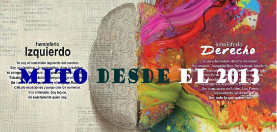
Por ejemplo, uno de tales mitos – del cual la mayoría no sospechábamos – es el de las funciones especializadas del cerebro izquierdo y del cerebro derecho. Muchos best sellers de divulgación científica continuarán reproduciendo este mito a pesar de que en el año 2013 se observó que la «imaginación» no está localizada en el hemisferio derecho sino que abarca a todo el cerebro, desmoronando la conceptualización que localiza la creatividad y la imaginación en el hemisferio cerebral derecho.

Este mito seguirá colonizando mentes a nivel masivo. Sobre todo si los expertos que cuentan con difusión y confianza del público siguen difundiéndolo. Tanto en el mundo de ladrillos como en Internet, el público no siempre está a salvo de contagio de mitos.

Puede sonar mal pero es un hecho: los mitos pueden existir en cualquier nivel. Es falso que los mitos existan sólo donde no hay garantías de confiabilidad. La confianza depositada en un alto nivel de conocimientos no siempre garantiza actualización de conocimientos ni observación de nuevos conocimientos, ni que se hayan establecido las conexiones entre conocimientos nuevos y previos.

Estamos en una era de cambios rápidos en nuestros entornos, pronto será también una era de cambios y evolución de nuestras posibilidades, para ello necesitaremos detectar mitos no sólo donde nos señalan los típicos cazadores de mitos sino también donde a veces no parecen dispuestos a buscar: en el propio ámbito de la racionalidad.


Patricio Jorge Vargas:
Related Post